") 概率分布合成的數(shù)據(jù)上平均數(shù)的探索詳細(xì)資料概述
概率分布合成的數(shù)據(jù)上平均數(shù)的探索詳細(xì)資料概述

Philadelphia Media Network資深數(shù)據(jù)分析師Daniel McNichol使用R語(yǔ)言演示了畢達(dá)哥拉斯平均數(shù)在不同概率分布上的效果。
這篇?jiǎng)t將在技術(shù)方面更深入一點(diǎn),在一些概率分布合成的數(shù)據(jù)上探索這些平均數(shù)。接著我們將考察一些可供比較的“真實(shí)世界”大型數(shù)據(jù)集。這篇的使用的表述也會(huì)更簡(jiǎn)短,假定讀者對(duì)高等數(shù)學(xué)和概率論有所了解。
畢達(dá)哥拉斯平均數(shù)溫習(xí)
讓我們復(fù)習(xí)一下,有3種畢達(dá)哥拉斯平均數(shù),遵循如下不等關(guān)系:
調(diào)和平均數(shù) ≤ 幾何平均數(shù) ≤ 算術(shù)平均數(shù)
僅當(dāng)數(shù)據(jù)集中的所有數(shù)字都相等時(shí),這3種平均數(shù)才相等。
算術(shù)平均數(shù)通過(guò)加法和除法得到。
幾何平均數(shù)通過(guò)乘法和開(kāi)方根得到。
調(diào)和平均數(shù)通過(guò)倒數(shù)、加法、除法得到。
它們的公式為:
圖片來(lái)源:維基百科
每種平均數(shù)可以表達(dá)為另一種平均數(shù)的再配置。例如:
幾何平均數(shù)不過(guò)是數(shù)據(jù)集中的值的對(duì)數(shù)變換的算術(shù)平均數(shù)的反對(duì)數(shù)。有時(shí)它也能保留伸縮到同一分母后的算術(shù)平均數(shù)的次序。
調(diào)和平均數(shù)不過(guò)是數(shù)據(jù)集中的值的倒數(shù)的算術(shù)平均數(shù)的倒數(shù)。它也可以通過(guò)適當(dāng)加權(quán)算術(shù)平均數(shù)重現(xiàn)。
經(jīng)驗(yàn)規(guī)則:
算術(shù)平均數(shù)最適合相加的、線性的、對(duì)稱(chēng)的、正態(tài)/高斯數(shù)據(jù)集。
幾何平均數(shù)最適合相乘的、幾何的、指數(shù)的、對(duì)數(shù)正態(tài)分布的、扭曲的數(shù)據(jù)集,以及尺度不同的比率和復(fù)合增長(zhǎng)的比率。
調(diào)和平均數(shù)是三種畢達(dá)哥拉斯平均數(shù)中最不常見(jiàn)的一種,但非常適合平均以分子為單位的比率,例如行程速度,一些財(cái)經(jīng)指數(shù),從物理到棒球的一些專(zhuān)門(mén)應(yīng)用,還有評(píng)估機(jī)器學(xué)習(xí)模型。
限制:
由于相對(duì)不那么常用,幾何平均數(shù)和調(diào)和平均數(shù)對(duì)一般受眾而言可能難以理解甚至?xí)`導(dǎo)他們。
幾何平均數(shù)是無(wú)單位(unitless)的,尺度和可解釋的單位在相乘操作中丟失了。
幾何平均數(shù)和調(diào)和平均數(shù)無(wú)法處理包含0的數(shù)據(jù)集。
詳細(xì)的討論,請(qǐng)參閱上篇。下面我們將查看一些實(shí)際的例子。
合成數(shù)據(jù)集
上篇中,我們?cè)谝恍┪⒉蛔愕赖臄?shù)據(jù)集(等差數(shù)列和等比數(shù)列)上觀察了畢達(dá)哥拉斯平均數(shù)的效果。這里我們將查看一些更大的合成數(shù)據(jù)集(實(shí)數(shù)集上的多種概率分布)。
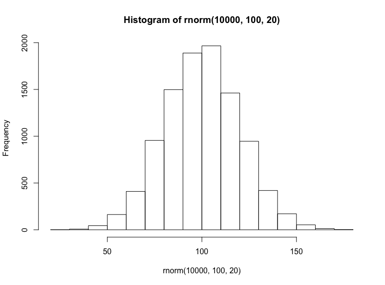
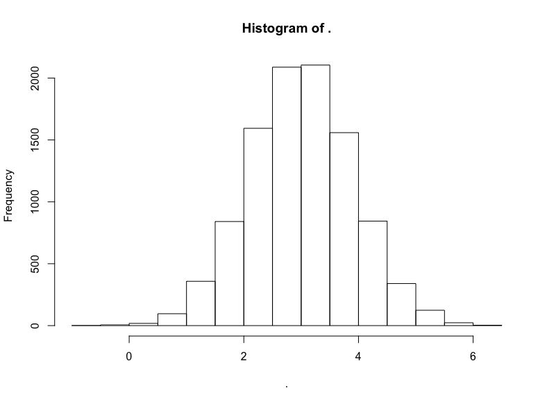
就相加或線性數(shù)據(jù)集而言,我們將從隨機(jī)正態(tài)分布(均值100、標(biāo)準(zhǔn)差20)中抽取10000個(gè)樣本:
hist(
rnorm( 10000, 100, 20 )
)
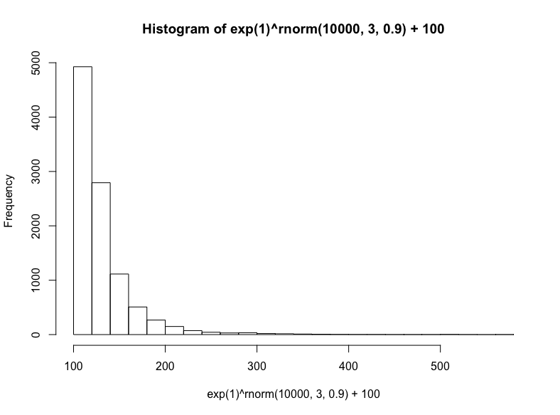
接著我們將模擬三種相乘數(shù)據(jù)集(盡管這些數(shù)據(jù)集具有有意義的差別,仍然常常難以區(qū)分):對(duì)數(shù)正態(tài)分布、指數(shù)分布、冪律分布。
有很多種生成對(duì)數(shù)正態(tài)分布的方法——基本上任何獨(dú)立同分布的隨機(jī)變量的乘法過(guò)程都將生成對(duì)數(shù)正態(tài)分布——這也正是它在真實(shí)世界中如此常見(jiàn)的原因,特別是在人類(lèi)活動(dòng)中。出于簡(jiǎn)單性和可解釋性方面的考慮,我們將以歐拉數(shù)為底數(shù),以從正態(tài)分布抽取的隨機(jī)數(shù)為指數(shù),然后加上100(使取值范圍大致相當(dāng)我們之前的正態(tài)分布):
hist(
exp(1)^rnorm(10000,3,.9) + 100,
breaks = 39
)
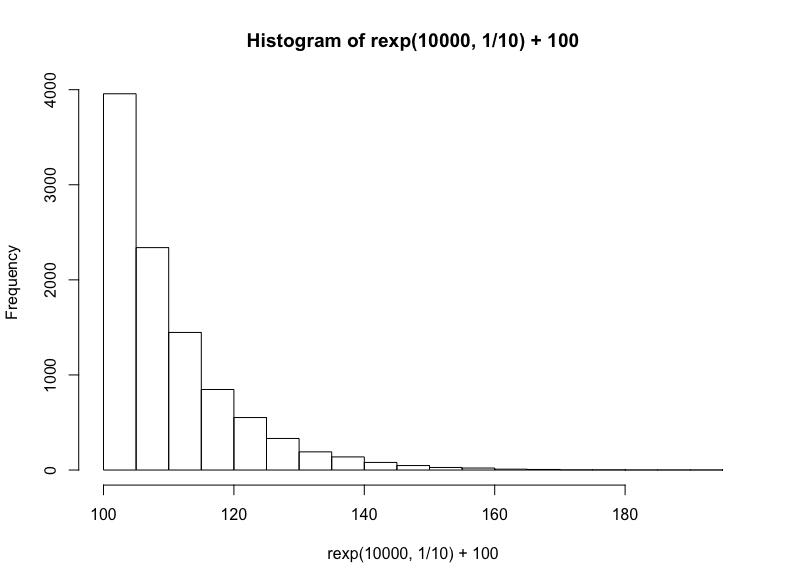
技術(shù)上說(shuō),這是指數(shù)分布的一個(gè)特例,但我們將通過(guò)R的rexp函數(shù)生成另一個(gè)指數(shù)分布,我們只需指定樣本數(shù)以及衰減率(同樣,我們?cè)诮Y(jié)果上加上100):
hist(
rexp(10000, 1/10) +100
)
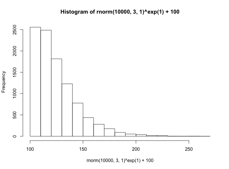
最后,我們將從正態(tài)分布取樣底數(shù),以歐拉數(shù)為指數(shù),接著加上100,生成冪律分布:
(注意,這是對(duì)數(shù)正態(tài)方法的反向操作,在生成對(duì)數(shù)正態(tài)分布時(shí),我們以歐拉數(shù)為底數(shù),以正態(tài)分布取樣為指數(shù))
hist(
rnorm(10000, 3, 1)^exp(1) + 100
)
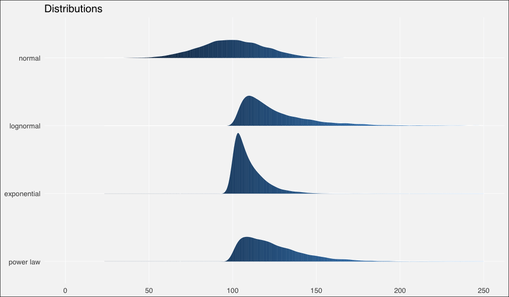
接著我們將使用ggridges包以更好地繪制分布,我們也將同時(shí)加載tidyverse包,任何有教養(yǎng)的R用戶(hù)都這么干:
library(tidyverse)
library(ggridges)
dist1 <- rnorm(10000, 100, 20) %>%
tibble(x=., distribution = "normal")
dist2 <- ( exp(1)^rnorm(10000, 3, .9) + 100 ) %>%
tibble(x=., distribution = "lognormal")
dist3 <- ( rexp(10000, 1/10) + 100 ) %>%
tibble(x=., distribution = "exponential")
dist4 <- ( rnorm(10000,3,1)^exp(1) + 100 ) %>%
tibble(x=., distribution = "power law")
dists <- bind_rows(dist1, dist2, dist3, dist4)
dist_ord <- c("normal", "lognormal", "exponential", "power law")
dists <- dists %>%
mutate(distribution = fct_relevel(distribution, dist_ord))
ggplot(dists, aes(x = x, y = fct_rev(distribution), fill=..x..)) +
geom_density_ridges_gradient(quantiles = 2, scale=0.9,
color='white', show.legend = F) +
theme_minimal(base_size = 13, base_family = "sans") +
scale_y_discrete(expand = c(0.1, 0)) + xlim(0, 250) +
theme(panel.grid.major = element_line(colour = "white",
size = .3),
panel.grid.minor = element_blank(),
plot.background = element_rect(fill = "whitesmoke"),
axis.title = element_blank(), legend.position="none") +
ggtitle(label = "Distributions")
現(xiàn)在讓我們計(jì)算一些概述統(tǒng)計(jì)量。
由于R沒(méi)有內(nèi)置幾何平均數(shù)或調(diào)和平均數(shù)的函數(shù),我們需要自行定義:
# 幾何平均數(shù)函數(shù)
gm_mean = function(x, na.rm=TRUE){
exp(sum(log(x[x > 0]), na.rm=na.rm) / length(x))
}
dist_stats <- dists %>% group_by(distribution) %>%
summarise(median = median(x),
am = mean(x),
gm = gm_mean(x),
hm = 1/mean(1/x) # 調(diào)和平均數(shù)公式
)
輸出:
# A tibble: 4 x 5
distribution median am gm hm
1 normal 99.699.997.795.4
2 lognormal 120 129 127 125
3 exponential 107 110 110 109
4 power law 120 125 124 122
……在繪制的圖形上加上這些平均數(shù):
ggplot(dists, aes(x = x, y = fct_rev(distribution), fill=..x..)) +
geom_density_ridges_gradient(quantiles = 2, scale=0.9,
color='white', show.legend = F) +
theme_minimal(base_size = 13, base_family = "sans") +
scale_y_discrete(expand = c(0.1, 0)) + xlim(0, 200) +
geom_point(data = dist_stats, aes(y=distribution, x=am),
colour="green3", shape=3, size=1, stroke =2,
alpha=.9, show.legend = F) +
geom_point(data = dist_stats, aes(y=distribution, x=gm),
colour="green3", fill="green3", shape=24, size=3,
alpha=.9, show.legend = F) +
geom_point(data = dist_stats, aes(y=distribution, x=hm),
colour="green3",fill= "green3", shape=25, size=3,
alpha=.9, show.legend = F) +
geom_segment(data = dist_stats, aes(x = median, xend = median,
y = c(4,3,2,1),
yend = c(4,3,2,1) + .3),
color = "salmon", show.legend = F) +
theme(panel.grid.major = element_line(colour = "white",
size = .3),
panel.grid.minor = element_blank(),
plot.background = element_rect(fill = "whitesmoke"),
axis.title = element_blank(), legend.position="none") +
ggtitle(label = "Distributions & summary statistics",
subtitle = "| : median : harmonic mean : geometric mean : arithmetic mean")
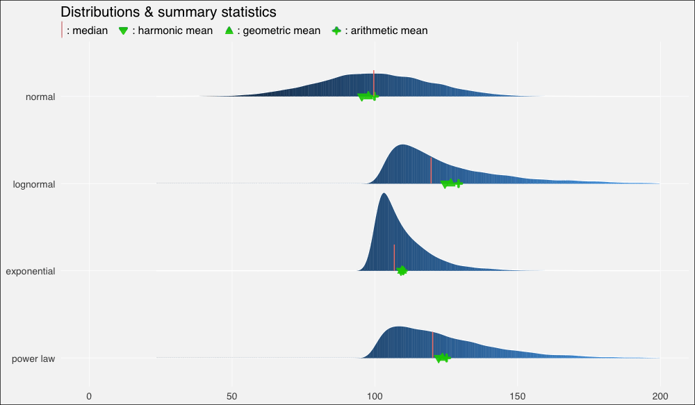
我們立刻看到了扭曲的密度的影響,以及平均數(shù)的重尾分布以及它們和中位數(shù)的關(guān)系:
在正態(tài)分布上,由于數(shù)據(jù)分布基本上是對(duì)稱(chēng)的,中位數(shù)和算術(shù)平均數(shù)幾乎相等(分別是99.6和99.9)。
在向右扭曲的其他分布上,所有平均數(shù)均位于中位數(shù)右方,靠近數(shù)據(jù)集較密集的駝峰。
不過(guò)上圖中的平均數(shù)有點(diǎn)擁擠,所以讓我們放大一點(diǎn)來(lái)看(調(diào)整xlim()):
...xlim(90, 150)...
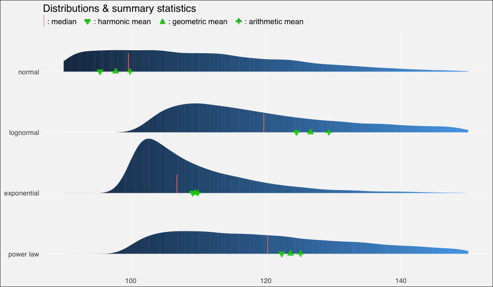
我們?cè)僖淮慰吹剑谡龖B(tài)、對(duì)稱(chēng)數(shù)據(jù)集上,幾何平均數(shù)和調(diào)和平均數(shù)低估了數(shù)據(jù)的“中點(diǎn)”,不過(guò)三個(gè)平均數(shù)大致上間隔的空間是相等的。
在對(duì)數(shù)正態(tài)分布上,中等瘦削的長(zhǎng)尾使平均數(shù)遠(yuǎn)離中位數(shù),甚至也扭曲了平均數(shù)的分布,使算術(shù)平均數(shù)到幾何平均數(shù)的距離比幾何平均數(shù)到調(diào)和平均數(shù)的距離更遠(yuǎn)。
在指數(shù)分布上,數(shù)值高度密集,指數(shù)瘦削的短尾飛速衰減,使得平均數(shù)也擠作一團(tuán)——盡管?chē)?yán)重的扭曲仍然使它們偏離中位數(shù)。
冪律分布衰減較慢,也因此具有最肥的尾部。它的“主體”部分仍然是接近正態(tài)的,在不對(duì)稱(chēng)分布中的扭曲是最輕微的。平均數(shù)之間的距離大致相等,不過(guò)仍然遠(yuǎn)離中位數(shù)。
我之前提到過(guò)幾何平均數(shù)和算術(shù)平均數(shù)之間的對(duì)數(shù)關(guān)系:
幾何平均數(shù)不過(guò)是數(shù)據(jù)集中的值的對(duì)數(shù)變換的算術(shù)平均數(shù)的反對(duì)數(shù)。
為了驗(yàn)證這一點(diǎn),讓我們?cè)倏匆豢次覀兊母攀鼋y(tǒng)計(jì)量表格:
# A tibble: 4 x 5
distribution median am gm hm
1 normal 99.699.997.795.4
2 lognormal 120 129 127 125
3 exponential 107 110 110 109
4 power law 120 125 124 122
注意我們的對(duì)數(shù)正態(tài)分布的幾何平均數(shù)是127.
現(xiàn)在我們計(jì)算對(duì)數(shù)變換值的算術(shù)平均數(shù):
dist2$x %>% log() %>% mean()
輸出:
4.84606
取反對(duì)數(shù):
exp(1)^4.84606
輸出:
127.2381
現(xiàn)在,為了把這一點(diǎn)講透徹,讓我們看看為什么會(huì)這樣(以及對(duì)數(shù)正態(tài)是如何得名的):
減去我們?cè)炯由系?00,然后取對(duì)數(shù):
(dist2$x — 100) %>% log() %>% hist()
名副其實(shí),對(duì)數(shù)正態(tài)分布的對(duì)數(shù)變換將產(chǎn)生正態(tài)分布。因此,正態(tài)分布中以相加為基礎(chǔ)的算術(shù)平均數(shù)的結(jié)果與對(duì)數(shù)正態(tài)分布中以相乘為本質(zhì)的幾何平均數(shù)的結(jié)果是一致的。
我們不應(yīng)該對(duì)對(duì)數(shù)正態(tài)分布的數(shù)據(jù)集經(jīng)過(guò)對(duì)數(shù)變換得到的無(wú)可挑剔的正態(tài)分布過(guò)于印象深刻,畢竟我們?cè)谥付ㄉ蓪?duì)數(shù)正態(tài)分布值的具體數(shù)據(jù)生成過(guò)程時(shí)就使用了正態(tài)分布,我們現(xiàn)在不過(guò)是反向操作以重現(xiàn)底層的正態(tài)分布而已。
現(xiàn)實(shí)世界中的事情很少如此整潔,現(xiàn)實(shí)世界的生成過(guò)程通常更復(fù)雜,是未知的,或者不可知的。因此如何建模和描述得自經(jīng)驗(yàn)的數(shù)據(jù)集充滿了困惑和爭(zhēng)議。
讓我們查看一些這樣的數(shù)據(jù)集,了解下真實(shí)世界的煩惱。
真實(shí)世界數(shù)據(jù)
盡管通常不像模擬數(shù)據(jù)那樣溫順,真實(shí)世界數(shù)據(jù)集通常至少再現(xiàn)了上述四種分布中的一種。
正態(tài)分布——喧鬧的“鐘形曲線”——最常出現(xiàn)在自然、生物場(chǎng)景中。身高和體重是經(jīng)典的例子。因此,我們的第一直覺(jué)是看看可信賴(lài)的iris數(shù)據(jù)集。它確實(shí)滿足要求,但樣本數(shù)有點(diǎn)小(數(shù)據(jù)集中單種花卉的樣本數(shù)為50)。我想要更大的數(shù)據(jù)集。
所以讓我們加載bigrquery包:
library(bigrquery)
Google的BigQuery提供了眾多真實(shí)數(shù)據(jù)的公開(kāi)數(shù)據(jù)集,其中一些非常大,例如基因、專(zhuān)利、維基百科文章數(shù)據(jù)。
回到我們最初的目標(biāo),natality(譯者注:natality意為出生率)看起來(lái)就很生物:
project <- “YOUR-PROJECT-ID”
sql <- “SELECT COUNT(*)
FROM `bigquery-public-data.samples.natality`”
query_exec(sql, project = project, use_legacy_sql = F)
(提示:由于有海量數(shù)據(jù),因此你可能需要為訪問(wèn)數(shù)據(jù)付費(fèi),不過(guò)每個(gè)月前1TB的數(shù)據(jù)訪問(wèn)是免費(fèi)的。另外,盡管出于明顯的原因,強(qiáng)烈不推薦使用SELECT *,SELECT COUNT(*)卻是一項(xiàng)免費(fèi)的操作,使用它確定范圍是個(gè)好主意。)
輸出:
137826763
一億三千七百萬(wàn)嬰兒數(shù)據(jù)!我們用不了這么多,所以讓我們隨機(jī)取樣1%嬰兒的體重,獲取前一百萬(wàn)結(jié)果:
sql <- “SELECT weight_pounds
FROM `bigquery-public-data.samples.natality`
WHERE RAND() < .01”
natal <- query_exec(sql, project = project, use_legacy_sql = F,
max_pages = 100)
hist(natal$weight_pounds)生成:
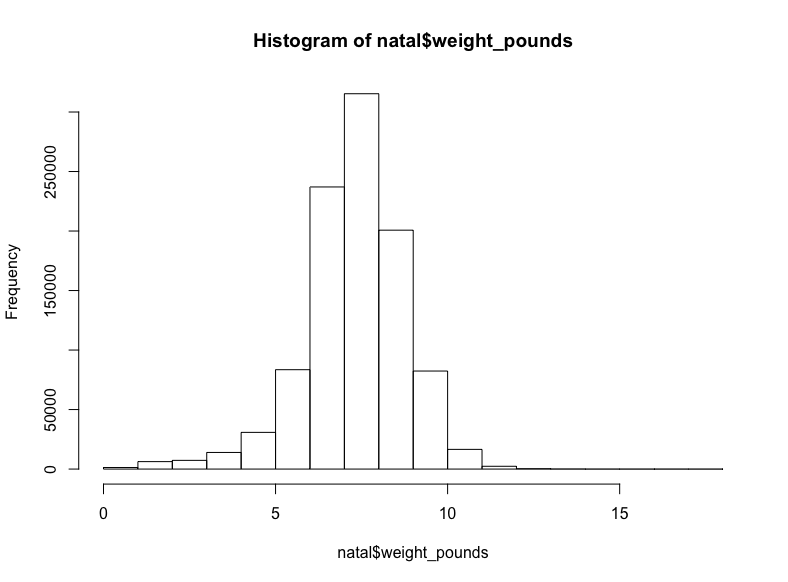
至少在我看來(lái)這是正態(tài)分布。
現(xiàn)在讓我們找找有些扭曲的相乘數(shù)據(jù),讓我們從生物學(xué)轉(zhuǎn)向社會(huì)學(xué)。
我們將查看New York(紐約)數(shù)據(jù)集,其中包含各種城市信息,包括黃色出租車(chē)和綠色出租車(chē)的行程信息(譯者注:紐約的出租車(chē)分為黃、綠兩種,兩者允許接客區(qū)域不同)。
sql <- “SELECT COUNT(*)
FROM `nyc-tlc.green.trips_2015`”
query_exec(sql, project = project, use_legacy_sql = F)
輸出:
9896012
不到一千萬(wàn)條記錄,所以讓我們抓取所有的行程距離:
(這可能需要花費(fèi)一點(diǎn)時(shí)間)
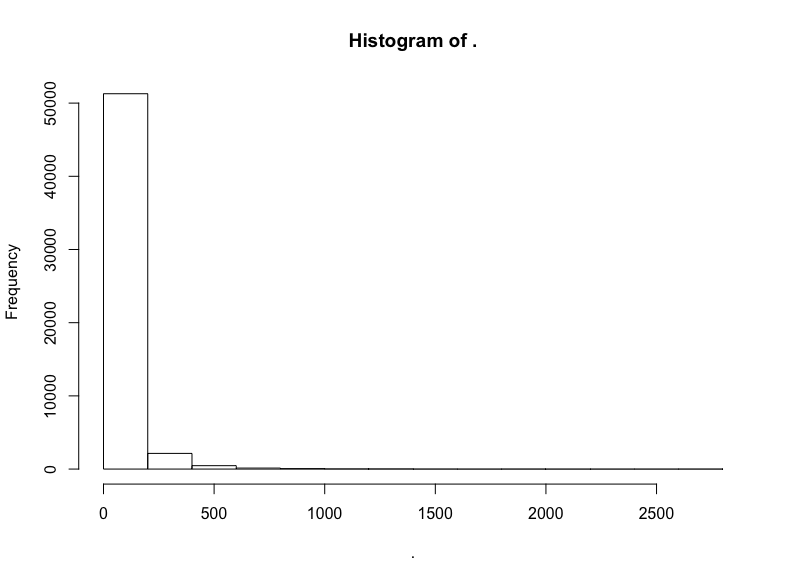
sql <- "SELECT trip_distance FROM `nyc-tlc.green.trips_2015`"
trips <- query_exec(sql, project = project, use_legacy_sql = F)
hist(trips$trips_distance)
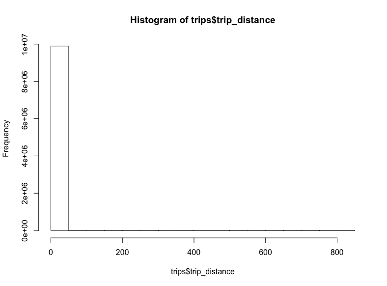
-_-
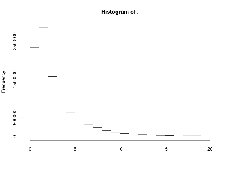
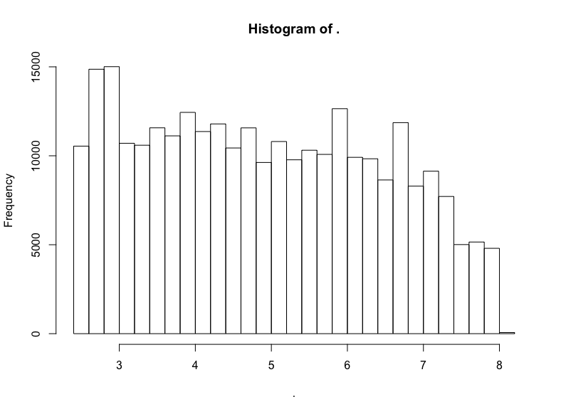
看起來(lái)一些極端的離散值將我們的x軸拉到了八百英里開(kāi)外。對(duì)出租車(chē)而言,這也太遠(yuǎn)了。讓我們移除這些離散值,將距離限定至20英里:
trips$trip_distance %>% subset(. <= 20) %>% hist()
我們做到了,得到了對(duì)數(shù)正態(tài)分布標(biāo)志性的長(zhǎng)尾。讓我們驗(yàn)證一下分布的對(duì)數(shù)正態(tài)性,繪制對(duì)數(shù)的直方圖:
trips$trip_distance %>% subset(. <= 20) %>% log() %>% hist()
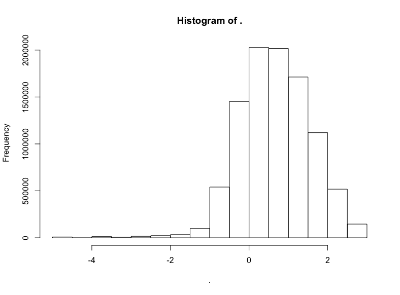
明顯有正態(tài)分布的樣子,不過(guò)偏離了一點(diǎn)靶心,有一點(diǎn)向左扭曲。哎呀,真實(shí)世界就是這樣的。不過(guò)我們有把握說(shuō),應(yīng)用對(duì)數(shù)正態(tài)分布至少不算荒謬。
讓我們繼續(xù)前行。尋找更重尾分布的數(shù)據(jù)。這次我們將使用Github數(shù)據(jù)集:
sql <- "SELECT COUNT(*)
FROM `bigquery-public-data.samples.github_nested`"
query_exec(sql, project = project, use_legacy_sql = F)
輸出:
2541639
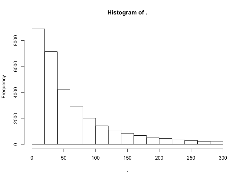
二百五十萬(wàn)項(xiàng)記錄。我開(kāi)始為本地機(jī)器的內(nèi)存擔(dān)心了,所以我將通過(guò)隨機(jī)取樣去掉一半數(shù)據(jù),然后查看剩余代碼倉(cāng)庫(kù)的關(guān)注數(shù)(watchers):
sql <- “SELECT repository.watchers
FROM `bigquery-public-data.samples.github_nested`
WHERE RAND() < .5”
github <- query_exec(sql, project = project, use_legacy_sql = F,
max_pages = 100)
github$watchers %>% hist()
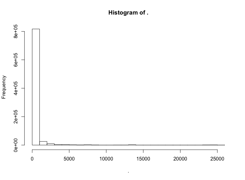
極端的長(zhǎng)尾,所以讓我們移除過(guò)低和過(guò)高的關(guān)注數(shù):
github$watchers %>% subset(5 < . & . < 3000) %>% hist()
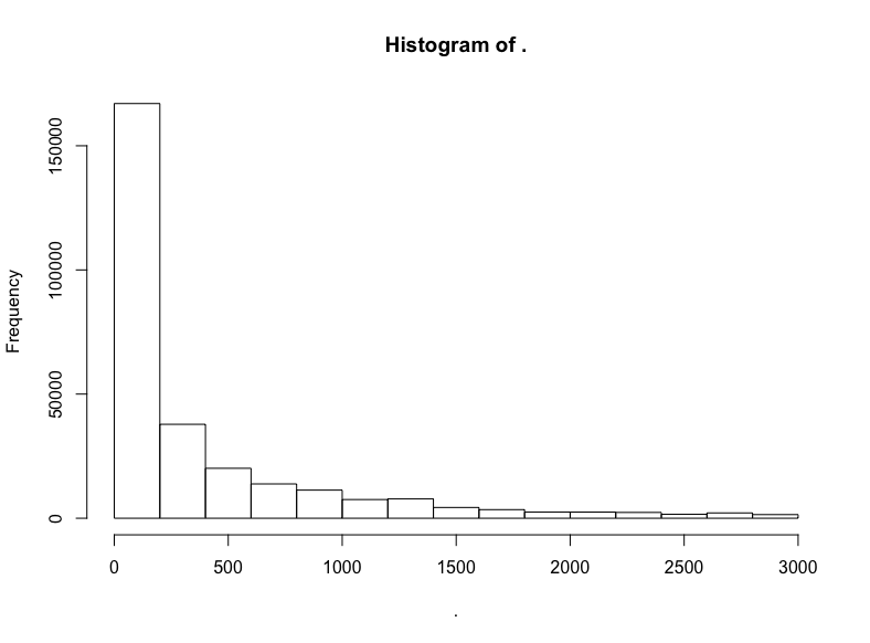
這是指數(shù)分布。
但是它是不是同時(shí)也是對(duì)數(shù)正態(tài)分布?
github$watchers %>% subset(5 < . & . < 3000) %>% log() %>% hist()
否。
不過(guò)我們看到了一頭珍稀的野獸:(逼近)LogUniform分布!
讓我們?cè)購(gòu)拇髷?shù)據(jù)中抽取一次,這次我們將查看Hacker News帖子的評(píng)分:
sql <- “SELECT COUNT(*)
FROM `bigquery-public-data.hacker_news.full`”
query_exec(sql, project = project, use_legacy_sql = F)
輸出:
16489224
我們抽取前10%的樣本:
sql <- “SELECT score
FROM `bigquery-public-data.hacker_news.full`
WHERE RAND() < .1”
hn <- query_exec(sql, project = project, use_legacy_sql = F,
max_pages = 100)
hn$score %>% hist()
同樣,我們截取中間部分的評(píng)分:
hn$score %>% subset(10 < . & . <= 300) %>% hist()
截取中間部分后,衰減得慢了。看看對(duì)數(shù)變換的結(jié)果?
hn$score %>% subset(10 < . & . <= 300) %>% log() %>% hist()
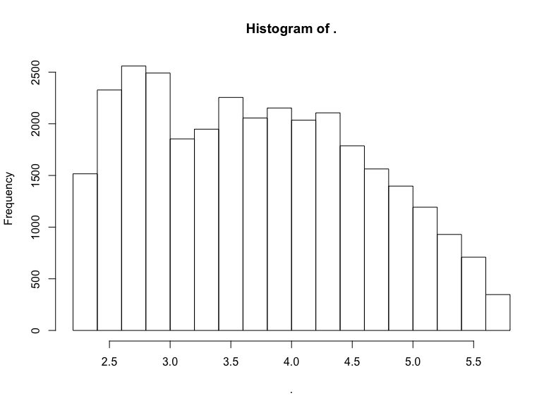
同樣大致是右向衰減的LogUniform分布。
我對(duì)冪律分布的搜尋沒(méi)有得到結(jié)果,這也許并不值得驚訝,畢竟冪律分布最常出現(xiàn)在網(wǎng)絡(luò)科學(xué)中(甚至,即使在網(wǎng)絡(luò)科學(xué)中,冪律分布看起來(lái)也比最初宣稱(chēng)的要罕見(jiàn))。
不管怎么說(shuō),讓我們也像模擬分布那樣繪制真實(shí)數(shù)據(jù)集的分布圖,并加以對(duì)比。同樣,我們將對(duì)其加以標(biāo)準(zhǔn)化,使其位于100左右。
# 定制標(biāo)準(zhǔn)化函數(shù)
normalize = function(x, na.rm = T){
(x-min(x[!is.na(x)]))/(max(x[!is.na(x)])-min(x[!is.na(x)]))
}
rndist1 <- (normalize(natality$weight_pounds) + 100) %>%
tibble(x=., distribution = "natal weights")
trip_trim <- trips$trip_distance %>% subset(. <= 20)
rndist2 <- (normalize(trip_trim) + 100) %>%
tibble(x=., distribution = "nyc green cab trips")
git_trim <- github$watchers %>% subset(5 < . & . < 3000)
rndist3 <- (normalize(git_trim) + 100) %>%
tibble(x=., distribution = "github watchers")
hn_trim <- hn$score %>% subset(10 < . & . <= 300)
rndist4 <- (normalize(hn_trim) + 100) %>%
tibble(x=., distribution = "hacker news scores")
rndists <- bind_rows(rndist1, rndist2, rndist3, rndist4)
rndist_ord <- c("natal weights", "nyc green cab trips",
"github watchers", "hacker news scores")
rndists <- rndists %>%
mutate(distribution = fct_relevel(distribution, rndist_ord))
ggplot(rndists, aes(x = x, y = fct_rev(distribution), fill=..x..)) +
geom_density_ridges_gradient(quantiles = 2, scale=0.9,
color='white', show.legend = F) +
theme_minimal(base_size = 13, base_family = "sans") +
scale_y_discrete(expand = c(0.1, 0)) + xlim(99.5, 101) +
theme(panel.grid.major = element_line(colour = "white", size = .3),
panel.grid.minor = element_blank(),
plot.background = element_rect(fill = "whitesmoke"),
axis.title = element_blank(), legend.position="none") +
ggtitle(label = "Distributions")
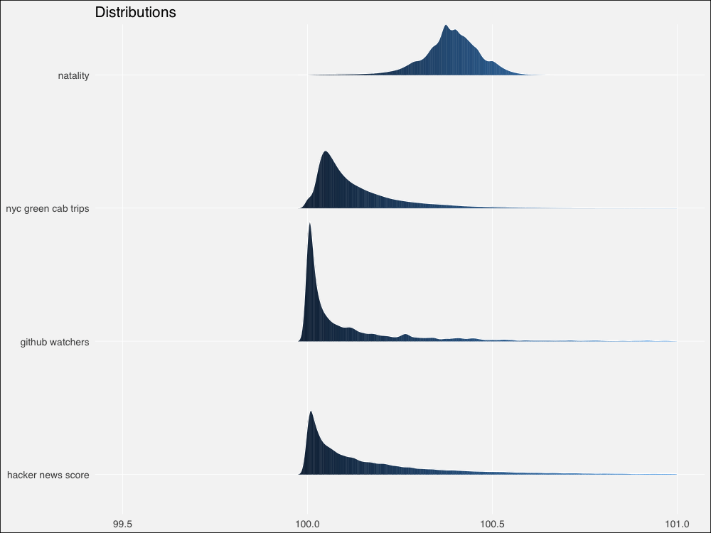
由于來(lái)自真實(shí)世界,和模擬分布相比,邊緣更加粗糙不平。不過(guò)仍然看起來(lái)相似。讓我們用Thomas Lin Pedersen的patchwork包繪制模擬分布和真實(shí)分布的對(duì)比圖:
# 將圖形分配給對(duì)象
p1 <-ggplot(dists, aes(x = x, y = fct_rev(distribution), fill=..x..)) +
geom_density_ridges_gradient(quantiles = 2, scale=0.9,
color='white', show.legend = F) +
theme_minimal(base_size = 13, base_family = "sans") +
scale_y_discrete(expand = c(0.1, 0)) + xlim(0, 250) +
theme(panel.grid.major = element_line(colour = "white", size = .3),
panel.grid.minor = element_blank(),
plot.background = element_rect(fill = "whitesmoke"),
axis.title = element_blank(), legend.position="none") +
ggtitle(label = "Distributions")
p2 <- ggplot(rndists, aes(x = x, y = fct_rev(distribution), fill=..x..)) +
geom_density_ridges_gradient(quantiles = 2, scale=0.9,
color='white', show.legend = F) +
theme_minimal(base_size = 13, base_family = "sans") +
scale_y_discrete(expand = c(0.1, 0)) + xlim(99.5, 101) +
theme(panel.grid.major = element_line(colour = "white", size = .3),
panel.grid.minor = element_blank(),
plot.background = element_rect(fill = "whitesmoke"),
axis.title = element_blank(), legend.position="none") +
ggtitle(label = "Distributions")
# 直接將圖形對(duì)象相加
p1 + p2
總體來(lái)看,模擬分布將為相鄰的真實(shí)數(shù)據(jù)集提供合理的模型,除了冪律 -> HackerNews評(píng)分這一對(duì)例外。
當(dāng)然有很多模型擬合方面的嚴(yán)謹(jǐn)測(cè)試,不過(guò)讓我們直接在分布上繪制概述統(tǒng)計(jì)量,就像我們之前做的那樣。
不幸的是,標(biāo)準(zhǔn)化的真實(shí)世界數(shù)據(jù)扭曲了概述統(tǒng)計(jì)量計(jì)算,使得結(jié)果多多少少難以區(qū)分。我懷疑這可能是因?yàn)橛?jì)算機(jī)的浮點(diǎn)計(jì)算精度問(wèn)題(不過(guò)也可能只是因?yàn)槲易约涸跀?shù)值計(jì)算上犯了錯(cuò)誤)。我不得不使用未標(biāo)準(zhǔn)化的真實(shí)世界數(shù)據(jù)單獨(dú)繪制,然后嘗試手工對(duì)齊。
讓我們組合未標(biāo)準(zhǔn)化的分布,然后計(jì)算概述性數(shù)據(jù):
# 未標(biāo)準(zhǔn)化
rdist1 <- natality$weight_pounds ?%>%
tibble(x=., distribution = "natal weights")
rdist2 <- trips$trip_distance %>% subset(. <= 20) %>%
tibble(x=., distribution = "nyc green cab trips")
rdist3 <- github$watchers %>% subset(5 < . & . < 3000) %>%
tibble(x=., distribution = "github watchers")
rdist4 <- hn$score %>% subset(10 < . & . <= 300) %>%
tibble(x=., distribution = "hacker news scores")
rdists <- bind_rows(rdist1, rdist2, rdist3, rdist4)
rdist_ord <- c("natal weights", "nyc green cab trips",
"github watchers", "hacker news scores")
rdists <- rdists %>%
mutate(distribution = fct_relevel(distribution, rdist_ord))
rdist_stats <- rdists %>% group_by(distribution) %>%
summarise(median = median(x, na, na.rm = T),
am = mean(x, na.rm = T),
gm = gm_mean2(x[x>0]),
hm = 1/mean(1/x[x>0], na.rm = T))
現(xiàn)在讓我們繪圖(這很丑陋因?yàn)槲覀冃枰獮槊總€(gè)真實(shí)分布創(chuàng)建單獨(dú)的圖形,好在patchwork讓我們可以?xún)?yōu)雅地定義布局):
# 模擬分布的繪圖和之前一樣
pm1 <- ggplot(dists, aes(x = x, y = fct_rev(distribution), fill=..x..)) +
geom_density_ridges_gradient(quantiles = 2, scale=0.9,
color='white', show.legend = F) +
theme_minimal(base_size = 13, base_family = "sans") +
scale_y_discrete(expand = c(0.1, 0)) + xlim(0, 250) +
geom_point(data = dist_stats, aes(y=distribution, x=am),
colour="green3", shape=3, size=1, stroke =2,
alpha=.9, show.legend = F) +
geom_point(data = dist_stats, aes(y=distribution, x=gm),
colour="green3", fill="green3", shape=24, size=3,# stroke = 1,
alpha=.9, show.legend = F) +
geom_point(data = dist_stats, aes(y=distribution, x=hm),
colour="green3",fill= "green3", shape=25, size=3,# stroke = 1,
alpha=.9, show.legend = F) +
geom_segment(data = dist_stats, aes(x = median, xend = median,
y = c(4,3,2,1),
yend = c(4,3,2,1) + .3),
color = "salmon", show.legend = F)+
theme(panel.grid.major = element_line(colour = "white", size = .3),
panel.grid.minor = element_blank(),
plot.background = element_rect(fill = "whitesmoke"),
axis.title = element_blank(), legend.position="none") +
ggtitle(label = "Distributions & summary statistics",
subtitle = "| : median : harmonic mean : geometric mean : arithmetic mean")
# 真實(shí)數(shù)據(jù)
p3 <- ?ggplot(rdist1, aes(x = x, y = distribution, fill = ..x..)) +
geom_density_ridges_gradient(quantiles = 2, scale=0.9,
color='white', show.legend = F) +
theme_minimal(base_size = 13, base_family = "sans") +
scale_y_discrete(expand = c(0.1, 0)) + #xlim(3, 11) +
geom_point(data = rdist_stats[1,], aes(y=distribution, x=am),
colour="green3", shape=3, size=1, stroke =2,
alpha=.9, show.legend = F) +
geom_point(data = rdist_stats[1,], aes(y=distribution, x=gm),
colour="green3", fill="green3", shape=24, size=3,# stroke = 1,
alpha=.9, show.legend = F) +
geom_point(data = rdist_stats[1,], aes(y=distribution, x=hm),
colour="green3",fill= "green3", shape=25, size=3,# stroke = 1,
alpha=.9, show.legend = F) +
geom_segment(data = rdist_stats[1,], aes(x = median, xend = median,
y = 1,
yend = 1 + .3),
color = "salmon", show.legend = F)+
theme(panel.grid.major = element_line(colour = "white", size = .3),
panel.grid.minor = element_blank(),
plot.background = element_rect(fill = "whitesmoke"),
axis.title = element_blank(), legend.position="none",
axis.text.x=element_blank())
p4 <- ?ggplot(rdist2, aes(x = x, y = distribution, fill = ..x..)) +
geom_density_ridges_gradient(quantiles = 2, scale=0.9,
color='white', show.legend = F) +
theme_minimal(base_size = 13, base_family = "sans") +
scale_y_discrete(expand = c(0.1, 0)) + #xlim(-1, 4) +
geom_point(data = rdist_stats[2,], aes(y=distribution, x=am),
colour="green3", shape=3, size=1, stroke =2,
alpha=.9, show.legend = F) +
geom_point(data = rdist_stats[2,], aes(y=distribution, x=gm),
colour="green3", fill="green3", shape=24, size=3,# stroke = 1,
alpha=.9, show.legend = F) +
geom_point(data = rdist_stats[2,], aes(y=distribution, x=hm),
colour="green3",fill= "green3", shape=25, size=3,# stroke = 1,
alpha=.9, show.legend = F) +
geom_segment(data = rdist_stats[2,], aes(x = median, xend = median,
y = 1,
yend = 1 + .3),
color = "salmon", show.legend = F)+
theme(panel.grid.major = element_line(colour = "white", size = .3),
panel.grid.minor = element_blank(),
plot.background = element_rect(fill = "whitesmoke"),
axis.title = element_blank(), legend.position="none",
axis.text.x=element_blank())
p5 <- ?ggplot(rdist3, aes(x = x, y = distribution, fill = ..x..)) +
geom_density_ridges_gradient(quantiles = 2, scale=200,
color='white', show.legend = F) +
theme_minimal(base_size = 13, base_family = "sans") +
scale_y_discrete(expand = c(0.1, 0)) + #xlim(20, 450) +
geom_point(data = rdist_stats[3,], aes(y=distribution, x=am),
colour="green3", shape=3, size=1, stroke =2,
alpha=.9, show.legend = F) +
geom_point(data = rdist_stats[3,], aes(y=distribution, x=gm),
colour="green3", fill="green3", shape=24, size=3,# stroke = 1,
alpha=.9, show.legend = F) +
geom_point(data = rdist_stats[3,], aes(y=distribution, x=hm),
colour="green3",fill= "green3", shape=25, size=3,# stroke = 1,
alpha=.9, show.legend = F) +
geom_segment(data = rdist_stats[3,], aes(x = median, xend = median,
y = 1,
yend = 1 + .3),
color = "salmon", show.legend = F)+
theme(panel.grid.major = element_line(colour = "white", size = .3),
panel.grid.minor = element_blank(),
plot.background = element_rect(fill = "whitesmoke"),
axis.title = element_blank(), legend.position="none",
axis.text.x=element_blank())
p6 <- ?ggplot(rdist4, aes(x = x, y = distribution, fill = ..x..)) +
geom_density_ridges_gradient(quantiles = 2, scale=40,
color='white', show.legend = F) +
theme_minimal(base_size = 13, base_family = "sans") +
scale_y_discrete(expand = c(.01, 0)) + #xlim(0, 100) +
geom_point(data = rdist_stats[4,], aes(y=distribution, x=am),
colour="green3", shape=3, size=1, stroke =2,
alpha=.9, show.legend = F) +
geom_point(data = rdist_stats[4,], aes(y=distribution, x=gm),
colour="green3", fill="green3", shape=24, size=3,# stroke = 1,
alpha=.9, show.legend = F) +
geom_point(data = rdist_stats[4,], aes(y=distribution, x=hm),
colour="green3",fill= "green3", shape=25, size=3,# stroke = 1,
alpha=.9, show.legend = F) +
geom_segment(data = rdist_stats[4,], aes(x = median, xend = median,
y = 1,
yend = 1 + .3),
color = "salmon", show.legend = F)+
theme(panel.grid.major = element_line(colour = "white", size = .3),
panel.grid.minor = element_blank(),
plot.background = element_rect(fill = "whitesmoke"),
axis.title = element_blank(), legend.position="none")
# 魔法般的patchwork布局語(yǔ)法
pm1 | (p3 / p4 / p5 / p6)
有趣的是,我們的真實(shí)世界數(shù)據(jù)集的概述統(tǒng)計(jì)量看起來(lái)明顯比模擬分布上更為分散。讓我們放大一點(diǎn)看看。
為了節(jié)省篇幅,我這里不會(huì)重復(fù)粘貼代碼,基本上我不過(guò)是修改了pm1的xlim(90, 150),并且去掉了上述代碼中的xlim()行的注釋?zhuān)?/p>
放大后對(duì)比更鮮明了。
我們對(duì)模擬和真實(shí)世界分布上的畢達(dá)哥拉斯平均數(shù)的探索到此為止。
如果你還沒(méi)有看過(guò)上篇,可以看一下,上篇給出了一個(gè)更明確、更直觀的介紹。同時(shí),別忘了參考后面給出的鏈接和進(jìn)一步閱讀。
另外,如果你想讀到更多這樣的文章,可以在Twitter、LinkedIn、Github上關(guān)注我(我在上面的用戶(hù)名都是dnlmc)。
-
概率
+關(guān)注
關(guān)注
0文章
17瀏覽量
13161 -
算術(shù)
+關(guān)注
關(guān)注
0文章
12瀏覽量
7486 -
數(shù)據(jù)集
+關(guān)注
關(guān)注
4文章
1236瀏覽量
26193
原文標(biāo)題:平均而言,你用的是錯(cuò)誤的平均數(shù)(下):平均數(shù)與概率分布
文章出處:【微信號(hào):jqr_AI,微信公眾號(hào):論智】歡迎添加關(guān)注!文章轉(zhuǎn)載請(qǐng)注明出處。
發(fā)布評(píng)論請(qǐng)先 登錄
新手求助:請(qǐng)問(wèn)怎么將數(shù)組中每100個(gè)數(shù),求平均數(shù)
新手求助:請(qǐng)問(wèn)怎么將數(shù)組中每隔n個(gè)數(shù)平均數(shù)
怎么查詢(xún)平均數(shù)
如何實(shí)現(xiàn)c++自動(dòng)輸出平均數(shù)?
求無(wú)符號(hào)數(shù)的平均數(shù)
如何操作多臺(tái)過(guò)采樣數(shù)據(jù)轉(zhuǎn)換器的詳細(xì)資料概述
LabVIEW在信捷PLC通訊上的應(yīng)用詳細(xì)資料概述
如何在開(kāi)發(fā)板上實(shí)現(xiàn)交通燈模擬的詳細(xì)資料概述
幾何平均數(shù)和調(diào)和平均數(shù)是什么?有什么作用?詳細(xì)資料討論
SV601187的詳細(xì)資料合集包括了電路圖,原理圖和介紹等詳細(xì)資料概述
組態(tài)王與數(shù)據(jù)庫(kù)連接的實(shí)現(xiàn)方法詳細(xì)資料概述

python的內(nèi)置函數(shù)詳細(xì)資料概述
CAN總線基礎(chǔ)的詳細(xì)資料概述

ADRF5144: 10 W平均數(shù),硅SPDT,反射開(kāi)關(guān),1千赫至20千兆赫數(shù)據(jù)表 ADI


 工商網(wǎng)監(jiān)
評(píng)論