") 鴻蒙ArkTS聲明式組件:ImageSpan
鴻蒙ArkTS聲明式組件:ImageSpan

ImageSpan
[Text]組件的子組件,用于顯示行內(nèi)圖片。
說明:
開發(fā)前請(qǐng)熟悉鴻蒙開發(fā)指導(dǎo)文檔 :[gitee.com/li-shizhen-skin/harmony-os/blob/master/README.md]
該組件從API Version 10開始支持。后續(xù)版本如有新增內(nèi)容,則采用上角標(biāo)單獨(dú)標(biāo)記該內(nèi)容的起始版本。
子組件
無
接口
ImageSpan(value: ResourceStr | PixelMap)
參數(shù):
| 參數(shù)名 | 參數(shù)類型 | 必填 | 參數(shù)描述 |
|---|---|---|---|
| value | [ResourceStr] | [PixelMap] | 是 |
屬性
[通用屬性]方法支持尺寸設(shè)置、背景設(shè)置、邊框設(shè)置。
| 名稱 | 參數(shù)類型 | 描述 |
|---|---|---|
| verticalAlign | [ImageSpanAlignment] | 圖片基于文本的對(duì)齊方式。 默認(rèn)值:ImageSpanAlignment.BOTTOM |
| objectFit | [ImageFit] | 設(shè)置圖片的縮放類型。 默認(rèn)值:ImageFit.Cover |
ImageSpanAlignment
| 名稱 | 描述 |
|---|---|
| TOP | 圖片上邊沿與文本上邊沿對(duì)齊。 |
| CENTER | 圖片中間與文本中間對(duì)齊。 |
| BOTTOM | 圖片下邊沿與文本下邊沿對(duì)齊。 |
| BASELINE | 圖片下邊沿與文本BaseLine對(duì)齊。HarmonyOS與OpenHarmony鴻蒙文檔籽料:mau123789是v直接拿 |
事件
通用事件僅支持[點(diǎn)擊事件]。
示例
// xxx.ets
@Entry
@Component
struct SpanExample {
  build() {
    Flex({ direction: FlexDirection.Column, alignItems: ItemAlign.Start}) {
      Text() {
        Span('This is the Span and ImageSpan component').fontSize(25).textCase(TextCase.Normal)
          .decoration({ type: TextDecorationType.None, color: Color.Pink })
      }.width('100%').textAlign(TextAlign.Center)
      Text() {
        ImageSpan($r('app.media.icon'))
          .width('200px')
          .height('200px')
          .objectFit(ImageFit.Fill)
          .verticalAlign(ImageSpanAlignment.CENTER)
        Span('I am LineThrough-span')
          .decoration({ type: TextDecorationType.LineThrough, color: Color.Red }).fontSize(25)
        ImageSpan($r('app.media.icon'))
          .width('50px')
          .height('50px')
          .verticalAlign(ImageSpanAlignment.TOP)
        Span('I am Underline-span')
          .decoration({ type: TextDecorationType.Underline, color: Color.Red }).fontSize(25)
        ImageSpan($r('app.media.icon'))
          .size({width:'100px', height:'100px'})
          .verticalAlign(ImageSpanAlignment.BASELINE)
        Span('I am Underline-span')
          .decoration({ type: TextDecorationType.Underline, color: Color.Red }).fontSize(25)
        ImageSpan($r('app.media.icon'))
          .width('70px')
          .height('70px')
          .verticalAlign(ImageSpanAlignment.BOTTOM)
        Span('I am Underline-span')
          .decoration({ type: TextDecorationType.Underline, color: Color.Red }).fontSize(50)
      }
      .width('100%')
      .textIndent(50)
    }.width('100%').height('100%').padding({ left: 0, right: 0, top: 0 })
  }
}

審核編輯 黃宇
聲明:本文內(nèi)容及配圖由入駐作者撰寫或者入駐合作網(wǎng)站授權(quán)轉(zhuǎn)載。文章觀點(diǎn)僅代表作者本人,不代表電子發(fā)燒友網(wǎng)立場(chǎng)。文章及其配圖僅供工程師學(xué)習(xí)之用,如有內(nèi)容侵權(quán)或者其他違規(guī)問題,請(qǐng)聯(lián)系本站處理。
舉報(bào)投訴
-
組件
+關(guān)注
關(guān)注
1文章
573瀏覽量
19018 -
鴻蒙
+關(guān)注
關(guān)注
60文章
2963瀏覽量
45886
發(fā)布評(píng)論請(qǐng)先 登錄
相關(guān)推薦
熱點(diǎn)推薦
HarmonyOS/OpenHarmony應(yīng)用開發(fā)-ArkTS的聲明式開發(fā)范式
軌跡。狀態(tài)與數(shù)據(jù)管理狀態(tài)數(shù)據(jù)管理作為基于ArkTS的聲明式開發(fā)范式的特色,通過功能不同的裝飾器給開發(fā)者提供了清晰的頁(yè)面更新渲染流程和管道。狀態(tài)管理包括UI組件狀態(tài)和應(yīng)用程序狀態(tài),兩者協(xié)
發(fā)表于 01-17 15:09
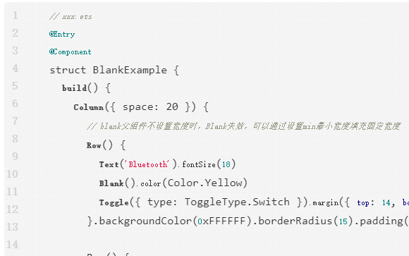
鴻蒙ArkTS聲明式組件:Blank
空白填充組件,在容器主軸方向上,空白填充組件具有自動(dòng)填充容器空余部分的能力。僅當(dāng)父組件為Row/Column/Flex時(shí)生效。
鴻蒙ArkTS聲明式組件:DataPanel
數(shù)據(jù)面板組件,用于將多個(gè)數(shù)據(jù)占比情況使用占比圖進(jìn)行展示。
鴻蒙ArkTS聲明式組件:Marquee
跑馬燈組件,用于滾動(dòng)展示一段單行文本。僅當(dāng)文本內(nèi)容寬度超過跑馬燈組件寬度時(shí)滾動(dòng),不超過時(shí)不滾動(dòng)。

鴻蒙ArkTS聲明式組件:PatternLock
圖案密碼鎖組件,以九宮格圖案的方式輸入密碼,用于密碼驗(yàn)證場(chǎng)景。手指在PatternLock組件區(qū)域按下時(shí)開始進(jìn)入輸入狀態(tài),手指離開屏幕時(shí)結(jié)束輸入狀態(tài)完成密碼輸入。
鴻蒙ArkTS聲明式組件:ScrollBar
滾動(dòng)條組件ScrollBar,用于配合可滾動(dòng)組件使用,如List、Grid、Scroll。
鴻蒙ArkTS聲明式組件:TextArea
多行文本輸入框組件,當(dāng)輸入的文本內(nèi)容超過組件寬度時(shí)會(huì)自動(dòng)換行顯示。

鴻蒙ArkTS聲明式組件:XComponent
可用于EGL/OpenGLES和媒體數(shù)據(jù)寫入,并顯示在XComponent組件。


 工商網(wǎng)監(jiān)
評(píng)論