") 深入淺出學(xué)習(xí)eTs之電量不足提示彈窗實(shí)例
深入淺出學(xué)習(xí)eTs之電量不足提示彈窗實(shí)例

本項(xiàng)目Gitee倉地址:深入淺出eTs學(xué)習(xí): 帶大家深入淺出學(xué)習(xí)eTs (gitee.com)
一、需求分析
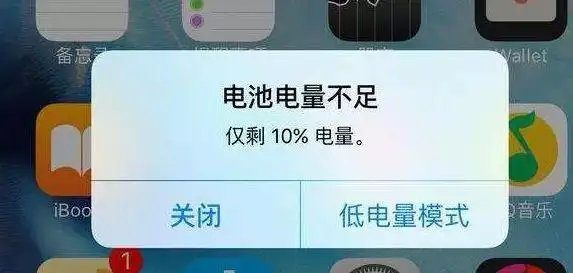
相信大家生活中也經(jīng)常會(huì)遇到上方情況,本章節(jié)我們來模擬提示一個(gè)電量不足的顯示,使用自定義彈窗來實(shí)現(xiàn)
提示電量不足
可以選擇關(guān)閉和低電量模式
顯示當(dāng)前剩余電量
二、控件介紹
自定義彈窗:官方文檔
說明: 從API Version 7開始支持。后續(xù)版本如有新增內(nèi)容,則采用上角標(biāo)單獨(dú)標(biāo)記該內(nèi)容的起始版本。
通過CustomDialogController類顯示自定義彈窗。
CustomDialogController(value:{builder: CustomDialog, cancel?: () => void, autoCancel?: boolean, alignment?: DialogAlignment, offset?: Offset, customStyle?: boolean})
參數(shù)
| 參數(shù)名 | 參數(shù)類型 | 必填 | 默認(rèn)值 | 參數(shù)描述 |
|---|---|---|---|---|
| builder | CustomDialog | 是 | - | 自定義彈窗內(nèi)容構(gòu)造器。 |
| cancel | () => void | 否 | - | 點(diǎn)擊遮障層退出時(shí)的回調(diào)。 |
| autoCancel | boolean | 否 | true | 是否允許點(diǎn)擊遮障層退出。 |
| alignment | DialogAlignment | 否 | DialogAlignment.Default | 彈窗在豎直方向上的對(duì)齊方式。 |
| offset | { dx: Length | Resource, dy: Length | Resource } | 否 | - | 彈窗相對(duì)alignment所在位置的偏移量。 |
| customStyle | boolean | 否 | false | 彈窗容器樣式是否自定義。 |
| gridCount8+ | number | 否 | - | 彈窗寬度占柵格寬度的個(gè)數(shù)。 |
DialogAlignment枚舉說明
| 名稱 | 描述 |
|---|---|
| Top | 垂直頂部對(duì)齊。 |
| Center | 垂直居中對(duì)齊。 |
| Bottom | 垂直底部對(duì)齊。 |
| Default | 默認(rèn)對(duì)齊。 |
| TopStart8+ | 左上對(duì)齊。 |
| TopEnd8+ | 右上對(duì)齊。 |
| CenterStart8+ | 左中對(duì)齊。 |
| CenterEnd8+ | 右中對(duì)齊。 |
| BottomStart8+ | 左下對(duì)齊。 |
| BottomEnd8+ | 右下對(duì)齊。 |
代碼介紹:
declare class CustomDialogController {
  constructor(value: CustomDialogControllerOptions); // 對(duì)話框控制器,控制彈框樣式等
  open();                                            // 打開對(duì)話框
  close();                                           // 關(guān)閉對(duì)話框
}

// 配置參數(shù)的定義
declare interface CustomDialogControllerOptions {
  builder: any;                                      // 彈框構(gòu)造器
  cancel?: () => void;                               // 點(diǎn)擊蒙層的事件回調(diào)
  autoCancel?: boolean;                              // 點(diǎn)擊蒙層是否自動(dòng)消失
  alignment?: DialogAlignment;                       // 彈框在豎直方向上的對(duì)齊方式
  offset?: Offset;                                   // 根據(jù)alignment的偏移
  customStyle?: boolean;                             // 是否是自定義樣式
  gridCount?: number;                                // grid數(shù)量
}
CustomDialogController
導(dǎo)入對(duì)象
dialogController : CustomDialogController = new CustomDialogController(value:{builder: CustomDialog, cancel?: () => void, autoCancel?: boolean})
open()
open(): void
顯示自定義彈窗內(nèi)容,若已顯示,則不生效。
close
close(): void
關(guān)閉顯示的自定義彈窗,若已關(guān)閉,則不生效。
三、UI設(shè)計(jì)
(1)彈窗實(shí)現(xiàn)
本章節(jié)的UI設(shè)計(jì)特別簡單,僅需要實(shí)現(xiàn)一個(gè)彈窗即可
開介紹,我們需要在@Entry外進(jìn)行定義,定義類型是@CustomDialog,其基本結(jié)構(gòu)如下(官網(wǎng))
@CustomDialog
struct CustomDialogExample {
  controller: CustomDialogController
  cancel: () => void
  confirm: () => void

  build() {
    Column() {
      Text('Software uninstall').width('70%').fontSize(20).margin({ top: 10, bottom: 10 })
      Image($r('app.media.icon')).width(80).height(80)
      Text('Whether to uninstall a software?').fontSize(16).margin({ bottom: 10 })
      Flex({ justifyContent: FlexAlign.SpaceAround }) {
        Button('cancel')
          .onClick(() => {
            this.controller.close()
            this.cancel()
          }).backgroundColor(0xffffff).fontColor(Color.Black)
        Button('confirm')
          .onClick(() => {
            this.controller.close()
            this.confirm()
          }).backgroundColor(0xffffff).fontColor(Color.Red)
      }.margin({ bottom: 10 })
    }
  }
}
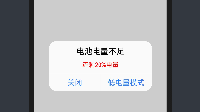
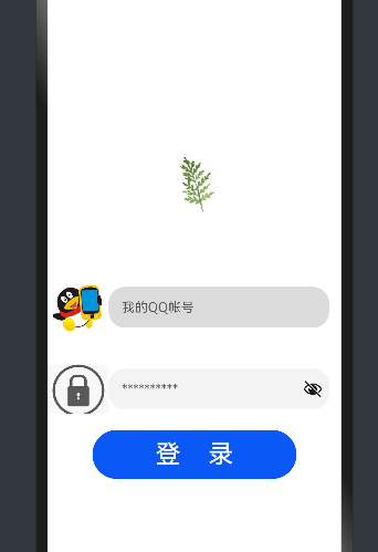
通過上面的程序可以實(shí)現(xiàn)下面的效果
我們需要對(duì)內(nèi)容和格式進(jìn)行修改
@CustomDialog
struct CustomBatteryDialog  {
  controller: CustomDialogController
  cancel: () => void
  confirm: () => void

  build() {
    Stack() {
      Column() {
        Text('電池電量不足')
          .fontSize(22)
          .margin({top: 15})
          .fontColor(Color.Black)
        Text('還剩20%電量')
          .fontSize(17)
          .margin({top: 15})
          .fontColor(Color.Red)
        Text()
          .size({width: "100%", height: "2px"})
          .backgroundColor("#bebbc1")
          .margin({top: 15})
        Row() {
          Text("關(guān)閉")
            .height("100%")
            .layoutWeight(1)
            .textAlign(TextAlign.Center)
            .fontSize(20)
            .fontColor("#317ef5")
            .onClick(() => {
              this.controller.close(); // 關(guān)閉彈窗
            })
          Text()
            .size({width: "2px", height: "100%"})
            .backgroundColor("#bebbc1")
          Text("低電量模式")
            .textAlign(TextAlign.Center)
            .fontSize(20)
            .fontColor("#317ef5")
            .height("100%")
            .layoutWeight(1)
            .onClick(() => {
              this.controller.close(); // 關(guān)閉彈窗
            })
        }
        .height(45)
        .width('100%')
      }
      .backgroundColor("#e6ffffff")
      .borderRadius(20)
    }
    .padding({left: 40, right: 40})
    .width("100%")
  }
}
實(shí)現(xiàn)效果如下:
(2)彈窗調(diào)用
彈窗調(diào)用的函數(shù)為this.controller.open(),一般是通過給定事件,像點(diǎn)擊按鈕或者之類,我們這里選擇使用直接彈窗的形式(打開APP就彈窗)
使用到函數(shù)為onPageShow(),其位置在該位置:
@Entry
@Component
struct Index {

  onPageShow() {
    this.controller.open()

  }

  build() {

  }
}
四、系統(tǒng)演示
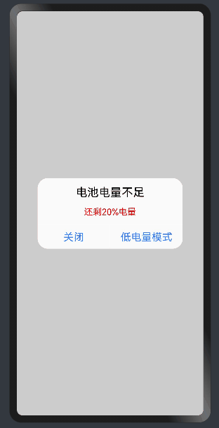
已實(shí)現(xiàn)效果,如上圖所示。
編輯:黃飛
-
ets
+關(guān)注
關(guān)注
0文章
20瀏覽量
1938 -
OpenHarmony
+關(guān)注
關(guān)注
33文章
3952瀏覽量
21102
發(fā)布評(píng)論請(qǐng)先 登錄
#深入淺出學(xué)習(xí)eTs#(八)“猜大小”小游戲
#深入淺出學(xué)習(xí)eTs#(十)藍(lán)藥丸還是紅藥丸

#深入淺出學(xué)習(xí)eTs#(一)模擬器/真機(jī)環(huán)境搭建
#深入淺出學(xué)習(xí)eTs#(二)拖拽式UI
#深入淺出學(xué)習(xí)eTs#(七)判斷密碼是否正確
#深入淺出學(xué)習(xí)eTs#(十二)您的電量不足
深入淺出學(xué)習(xí)eTs(一)模擬器/真機(jī)環(huán)境搭建
深入淺出學(xué)習(xí)eTs(七)如何判斷密碼是否正確
深入淺出學(xué)習(xí)eTs之九宮格密碼鎖功能實(shí)現(xiàn)


 工商網(wǎng)監(jiān)
評(píng)論